How to customize react day picker
Introduction
This tutorial will guide you through the process of customizing the react day picker component using Tailwind CSS. We'll cover the basics of setting up the project, creating the component, and styling the elements.
Prerequisites
Before we begin, make sure you have the following installed:
- React.js or (Any other react framework)
- Tailwind CSS
- Vite
- React Day Picker
Setting Up the Project
To get started, create a new Vite project using the following command:
npm init vite@latest my-react-day-picker-app --template react-ts
Next, navigate to the project directory and install the necessary dependencies:
cd my-react-day-picker-app
npm install react-day-picker tailwindcss
Then, Go to the gloabl.css or index.css file and add the following code:
@tailwind base;
@tailwind components;
@tailwind utilities;
Customize react day picker component
- Customize the appearance of the component
- Add components and functionalities to date picker
- Customize the date picker's behavior
- Add custom icons to arrow's
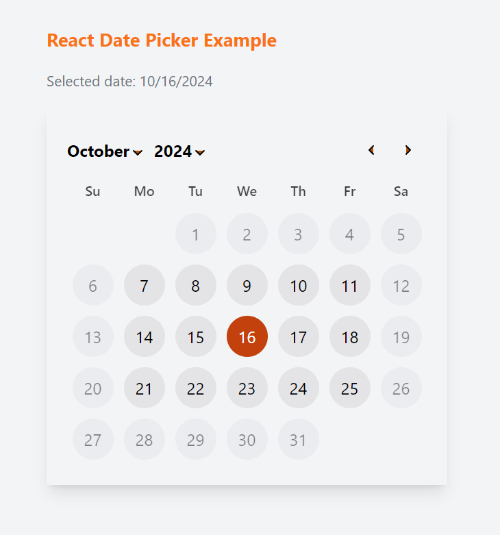
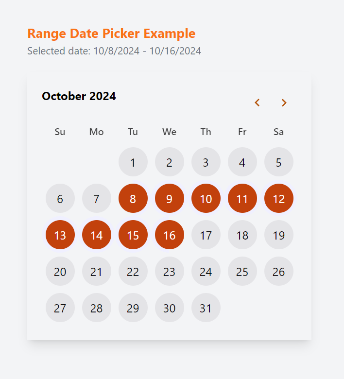
Here's what we're aiming for:

Implementation Steps - Single Mode Calendar Example
Step 1: Create the Custom Day Picker Component
First, let's set up our CustomDayPicker.tsx component:
import React from 'react';
const CustomDayPicker = () => {
return (
<div>Custom Day Picker Component</div>
);
};
export default CustomDayPicker;
Step 2: Add React Day Picker
We'll use the DayPicker component from the react-day-picker library to create our custom day picker:
import React from 'react';
import { DayPicker } from "react-day-picker";
import "react-day-picker/style.css";
const CustomDayPicker = () => {
const [selected, setSelected] = React.useState<Date | undefined>(undefined);
const handleDayClick = (day: Date | undefined) => {
setSelected(day);
};
return (
<div className="flex flex-col items-center justify-center">
<p className="text-lg text-orange-500 font-bold">
React Date Picker Example
</p>
<p className="text-sm text-gray-500">
Selected date: {selected?.toLocaleDateString()}
</p>
<DayPicker
mode="single"
onSelect={handleDayClick}
selected={selected}
/>
</div>
);
};
Step 3: Add Custom styles
To customize the appearance of the day picker, we can use the DayPicker component's classNames and 'components' prop to add custom styles:
import React from 'react';
import { DayPicker, getDefaultClassNames } from "react-day-picker";
import { ChevronDown, ChevronLeft, ChevronRight, Circle } from "lucide-react";
import "react-day-picker/style.css";
const CustomDayPicker = () => {
const [selected, setSelected] = React.useState<Date | undefined>(undefined);
const defaultClassNames = getDefaultClassNames();
const handleDayClick = (day: Date | undefined) => {
setSelected(day);
};
return (
<div className="flex flex-col items-center justify-center">
<p className="text-lg text-orange-500 font-bold">
React Date Picker Example
</p>
<p className="text-sm text-gray-500">
Selected date: {selected?.toLocaleDateString()}
</p>
<DayPicker
mode="single"
onSelect={handleDayClick}
selected={selected}
classNames={{
selected: `text-white`,
root: `${defaultClassNames.root} shadow-lg p-5`,
day: `group w-10 h-10 rounded-full ${defaultClassNames.day}`,
caption_label: `text-base`,
}}
components={{
/* Custom Button */
DayButton: (props) => {
const { day, ...buttonProps } = props;
return (
<button
{...buttonProps}
className="bg-zinc-200 w-10 h-10 m-1 group-aria-selected:bg-orange-700 rounded-full"
onClick={() => setSelected(day.date)}
/>
);
},
/* Custom Chevron Icon */
Chevron: ({ className, orientation, ...chevronProps }) => {
switch (orientation) {
case "left":
return (
<ChevronLeft
className={`${className} w-4 h-4 fill-amber-700`}
{...chevronProps}
/>
);
case "right":
return (
<ChevronRight
className={`${className} w-4 h-4 fill-amber-700`}
{...chevronProps}
/>
);
case "down":
return (
<ChevronDown
className={`${className} w-4 h-4 fill-amber-700`}
{...chevronProps}
/>
);
case "up":
return (
<ChevronDown
className={`${className} w-4 h-4 fill-amber-700`}
{...chevronProps}
/>
);
default:
return (
<Circle className={`${className} w-4 h-4 fill-amber-700`} />
);
}
},
}}
/>
</div>
);
};
Step 4: Add functionality to the Custom Day Picker
Now, let's enhance the functionality of our custom day picker component by adding the following features:
- Disable selection of previous dates, Saturdays, and Sundays from the chosen date.
- Allow selection of dates up to 20 days from the current date.
- Set the starting year as 2020 and the ending year as 2025.
import React from 'react';
import { DayPicker, getDefaultClassNames } from "react-day-picker";
import { ChevronDown, ChevronLeft, ChevronRight, Circle } from "lucide-react";
import "react-day-picker/style.css";
const CustomDayPicker = () => {
const [selected, setSelected] = React.useState<Date | undefined>(undefined);
/* Today's date */
const today = new Date();
/* Calculate the date 20 days from today */
const twentyDaysFromNow = new Date();
twentyDaysFromNow.setDate(today.getDate() + 20);
/* Years Start from */
const startYear = new Date(2010, 0);
/* Years End from */
const endYear = new Date(2025, 0);
const handleDayClick = (day: Date | undefined) => {
setSelected(day);
};
return (
<div className="flex flex-col items-center justify-center">
<p className="text-lg text-orange-500 font-bold">
React Date Picker Example
</p>
<p className="text-sm text-gray-500">
Selected date: {selected?.toLocaleDateString()}
</p>
<DayPicker
mode="single"
selected={selected}
onDayClick={handleDayClick}
disabled={[
{ before: today },
{ dayOfWeek: [0, 6] },
{ after: twentyDaysFromNow },
]}
startMonth={startYear}
endMonth={endYear}
classNames={{
selected: `text-white`,
root: `${defaultClassNames.root} shadow-lg p-5`,
day: `group w-10 h-10 rounded-full ${defaultClassNames.day}`,
caption_label: `text-base`,
}}
components={{
/* Custom Button */
DayButton: (props) => {
const { day, ...buttonProps } = props;
return (
<button
{...buttonProps}
className="bg-zinc-200 w-10 h-10 m-1 group-aria-selected:bg-orange-700 rounded-full"
onClick={() => setSelected(day.date)}
/>
);
},
/* Custom Chevron Icon */
Chevron: ({ className, orientation, ...chevronProps }) => {
switch (orientation) {
case "left":
return (
<ChevronLeft
className={`${className} w-4 h-4 fill-amber-700`}
{...chevronProps}
/>
);
case "right":
return (
<ChevronRight
className={`${className} w-4 h-4 fill-amber-700`}
{...chevronProps}
/>
);
case "down":
return (
<ChevronDown
className={`${className} w-4 h-4 fill-amber-700`}
{...chevronProps}
/>
);
case "up":
return (
<ChevronDown
className={`${className} w-4 h-4 fill-amber-700`}
{...chevronProps}
/>
);
default:
return (
<Circle className={`${className} w-4 h-4 fill-amber-700`} />
);
}
},
}}
/>
</div>
);
};
Step 5: Use the Custom Day Picker Component
Finally, import and use the CustomDayPicker component in your desired page or component:
import CustomDayPicker from '@/components/CustomDayPicker';
export default function Home() {
return (
<div>
<h1>Welcome to My App</h1>
<CustomDayPicker />
</div>
);
}
Implementation - Range Mode Calendar Example

Create the Custom Range Day Picker Component
First, let's set up our CustomRangeDayPicker.tsx component:
import React from "react";
import { DayPicker, getDefaultClassNames } from "react-day-picker";
export const CustomRangeDayPicker = () => {
const [selected, setSelected] = React.useState<{
from: Date | null;
to: Date | null;
}>();
const defaultClassNames = getDefaultClassNames();
/* Today's date */
const today = new Date();
return (
<div className="block">
<p className="text-lg text-orange-500 font-bold">
Range Date Picker Example
</p>
<p className="text-sm text-gray-500 mb-5">
Selected date: {selected?.from?.toLocaleDateString()} -{" "}
{selected?.to?.toLocaleDateString()}
</p>
<DayPicker
mode="range"
selected={
selected?.from && selected?.to
? { from: selected.from, to: selected.to }
: undefined
}
onSelect={(selected) =>
setSelected(
selected?.from && selected?.to
? { from: selected.from, to: selected.to }
: undefined
)
}
disabled={[{ before: today }]}
className="custom-dropdown-root"
classNames={{
selected: `text-white`,
root: `${defaultClassNames.root} shadow-lg p-5`,
chevron: `w-4 h-4 fill-amber-700`,
day: `group w-10 h-10 rounded-full`,
caption_label: `text-base`,
disabled: `text-gray-500`,
}}
components={{
DayButton: (props) => {
const { ...buttonProps } = props;
return (
<button
{...buttonProps}
className="text-zinc-950 bg-zinc-200 w-10 h-10 m-1 group-aria-selected:bg-orange-700 group-aria-selected:text-white rounded-full"
/>
);
},
}}
/>
</div>
);
};

